KEIKOS
Fine Reserve
An editorial two-page site for a Turks & Caicos rum house distilled from fresh sugarcane juice and aged in French oak. We built the brand voice and a quiet narrative architecture — a marketing scroll for the bottle, plus a deep-dive about page for the founding story — that lets the islands and the method carry the page.
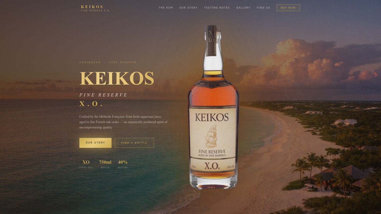
Keikos shipped its Fine Reserve X.O. into a market with no shortage of premium-rum tropes. Founder Rachel Constant Phillips had two centuries of Haitian distilling tradition behind the bottle and five named bars and shops in Turks & Caicos in front of it — and no global checkout to push customers to. The site had to do the persuading the price tag normally does, then point you to a real shelf.
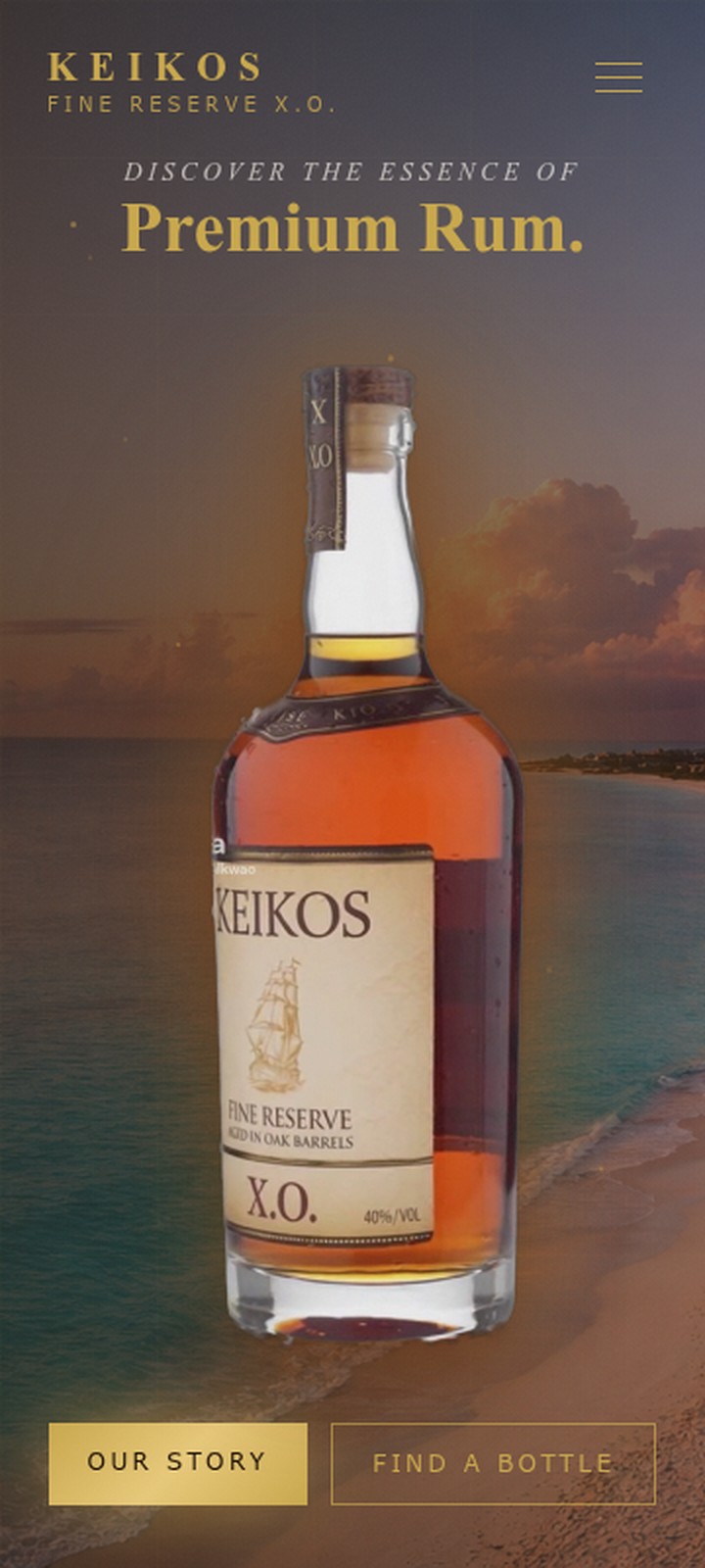
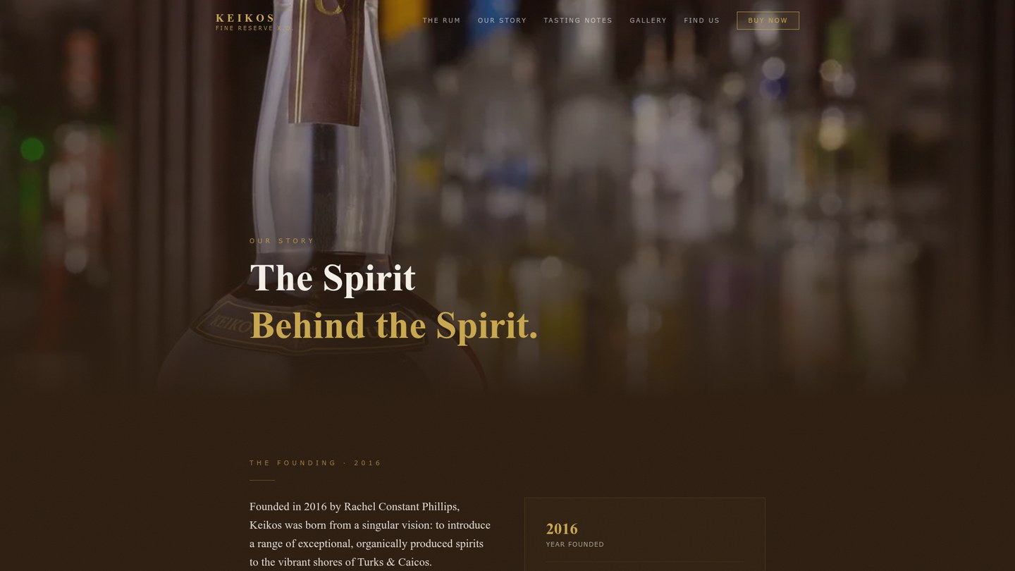
We shipped two pages. The homepage reads as a single editorial scroll — story, method, retailer — that earns the right to ask for a tasting before pointing you to where the bottle actually lives. A second page, "The Spirit Behind the Spirit," gives Rachel's founding story and the Méthode Française methodology room to breathe in their own deep-dive.
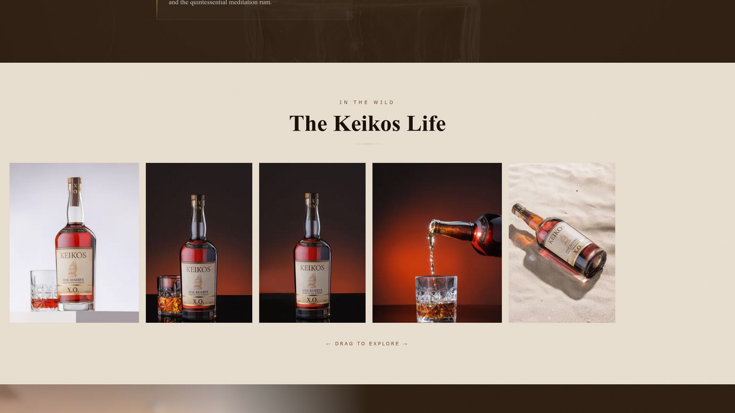
An editorial scroll that happens to sell rum.
The decision was to invert the usual rum-website hierarchy. Instead of a hero CTA pushing to a cart that doesn't exist — Keikos is retail-only across Turks & Caicos — we built a single page where the brand earns the right to ask for a tasting before pointing you to the shelf it's on.
Brand voice
Patient and unhurried, borrowed from how the rum is actually made. The voice has to do the work the price tag normally does — convince a buyer the bottle is worth a story before they've tasted it. Headlines lean on the method; body copy stays out of the way.
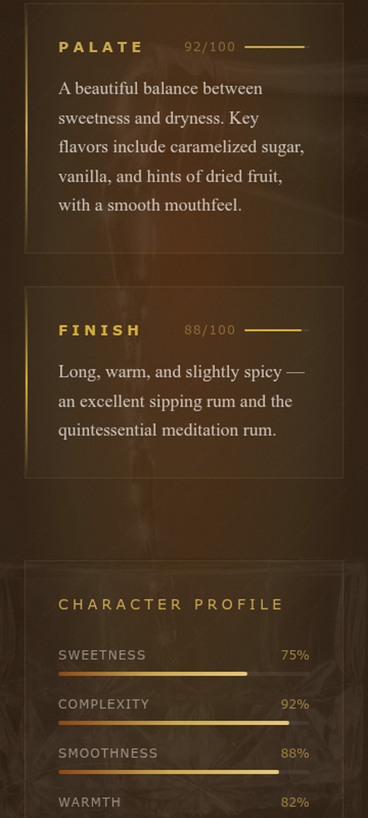
Sensory profile
Customers can't taste the rum before they buy. A scored profile across four fixed dimensions gives them the vocabulary to predict it — and gives the bottle a fingerprint they can recognize on a second visit.
Retailer locator
We replaced a global checkout we didn't have with a hyperlocal one we did. Five named TCI bars and shops with addresses you can map. Honest about where the bottle lives, useful to the people most likely to walk in and pick one up.
"The finest rum does not rush — it waits patiently in its barrel until it is ready to be great."